
This font is under a 'creative commons' license.
You are free to:
Share — copy and redistribute the material in any medium or format
Adapt — remix, transform, and build upon the material
The licensor cannot revoke these freedoms as long as you follow the license terms.
Under the following terms:
Attribution — You must give appropriate credit, provide a link to the license, and indicate if changes were made. You may do so in any reasonable manner, but not in any way that suggests the licensor endorses you or your use.
NonCommercial — You may not use the material for commercial purposes without permission.
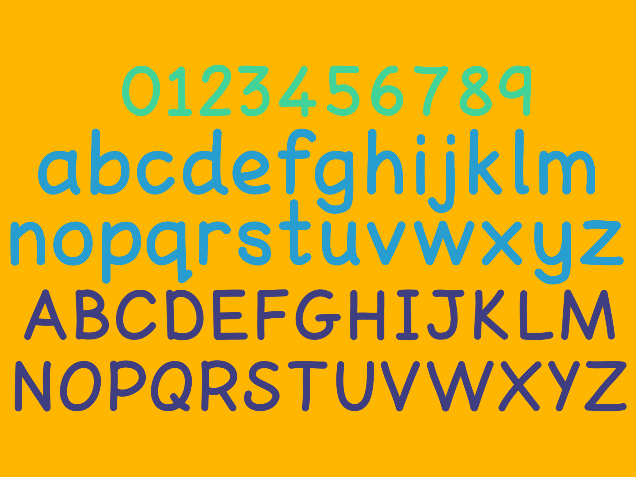
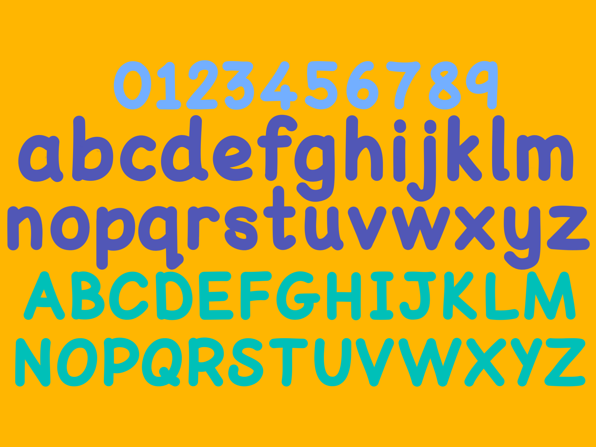
Dyslexic Logic Font is a free font that can be installed and used on Windows and iOS systems. It is completely free to use and share. It was developed inline with BDA guidelines and can be used just like every other font installed on your computer.
Dyslexic Logic Font - Features

Provides good letter spacing and avoids ‘blur’ between letter combinations.
The space between individual letter pairs (kerning) has been increased to reduce the blur between problematic pairs. The space between letters in general (tracking) is slightly wider to reduce crowding. In addition to space between individual words is wider to make scanning text easier.

Ensures clear distinctions between letters that can be confused.
This font ensures that capital letters, lower case letters and numbers can be clearly distinguished from one another.


Avoids mirror images.
The distinction between letter formations means that letters cannot be reversed or flipped to form other letters.

Provides clear ascenders and descenders.
Ascenders have been standardised so that letters like 'f' and 't' are the same height as other ascenders. Both ascenders and decenders are extended so they are clearly visible and distinct.

Uses rounded ‘a’ and ‘g’.
The letter 'a' and 'g' formations echo traditional handwriting. These are usually more familiar than 'looped' formations so are easier to identify. They also maintain the link between text and handwriting formations.

Mimics basic handwriting.
The letter formations reflect the shape of handwritten letter shapes. This means that children copying texts are automatically presented with a good model for precursive handwriting.

Reduces the number of different letter strokes needed.
To support handwriting development the consistency of letter strokes is maintained. This allows children to develop a good 'motor-memory' for stoke shape to increase handwriting fluency.